MARTA and the 2026 World Cup
| Role | Duration | Tools | Methods | Design | Evaluation |
|---|---|---|---|---|---|
| UX Research and Design | 4 months | Figma, Qualtrics, MAXQDA | Interviews, Surveys, Observation | Sketches, Wireframes, Prototyping | Heuristic Evaluation, Usability |
Overview
In 2026, Atlanta will host eight FIFA World Cup matches, bringing a surge of visitors to the city. As the largest transit system in the Southeast, MARTA serves millions of riders annually but has struggled with crowd management during past major events.To address these challenges, my team partnered with MARTA to simplify transit use and boost ridership for locals and visitors during the World Cup. Currently, MARTA's reliance on three separate apps for ticketing, transit info, and safety reporting risks confusing new users. We aimed to develop a unified, user-friendly app to streamline the transit experience.
The problem statement
How can we develop a user-friendly digital tool that enhances accessibility and promotes MARTA use during the 2026 World Cup?My Team
- Spencer Luke (Me) - Lead research
- Dani Generous - Research and writing
- Echo Cho - Lead Design
- Shachika Thanigaivelu - Design and writing
I led the research effort by developing research plans, defining objectives, and creating interview guides. I also served as the primary liaison with MARTA partners and organized research by coordinating interviews, focus groups, and meetings.
Defining the Problem
Atlanta anticipates 300,000+ visitors for the 2026 World Cup, with 75% from out of state. Qatar's tourism surge after the 2022 World Cup represents the significant impact of a successful event. My team aims to design solutions to enhance the World Cup experience, starting by identifying primary users.
Primary User Group and Shareholders
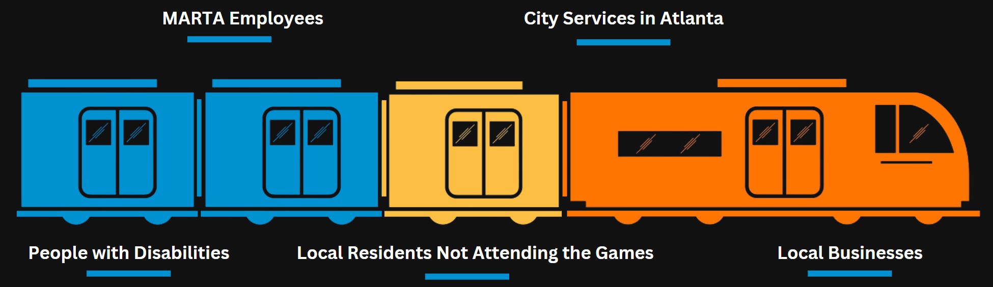
At the core of our research and design process are the diverse visitors and locals attending the 2026 World Cup in Atlanta.
Research Questions
| Research Question | Rationale | |
|---|---|---|
| 1. | What features of transit systems do users prioritize when using public transportation? | By understanding what users value, we can tailor an experience to best meet the needs of users. |
| 2. | How do users make decisions about whether to ride public transportation for events or choose alternatives? | Understanding why people may avoid MARTA allows us to improve services and better communicate its benefits. |
| 3. | What are the barriers people face when planning and riding public transportation? | Identifying confusion, limitations, and accessibility issues helps us develop solutions to boost MARTA use. |
| 4. | What is the user perception of MARTA? | Understanding user perception helps us target weak points in MARTA. |
| 5. | What problems do users face during times of high traffic on MARTA? | Understanding the key issues allows us to explore ways to alleviate them through interactive design. |
Research Phase
Comparative Analysis
First, we conducted a comparative analysis on similar transit networks to better understand the problem space.
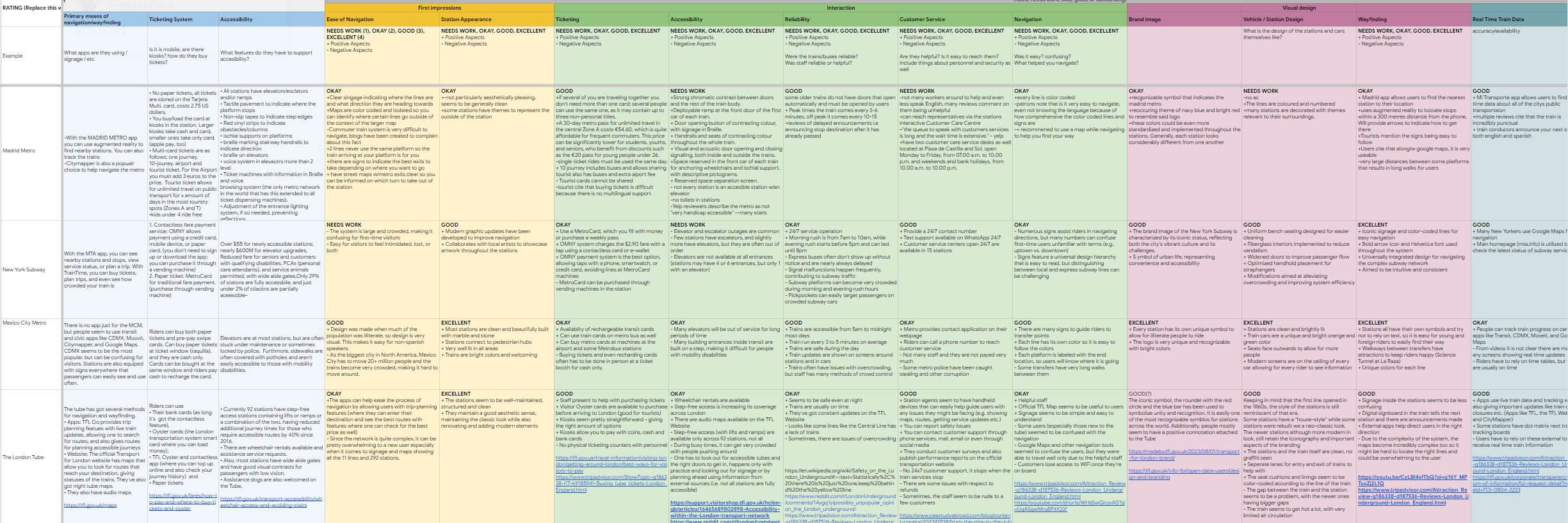
Method Details
We compared 5 transit systems chosen based on where World Cup fans would likely be coming from.
- São Paulo Metrô
- Madrid Metro
- New York Subway
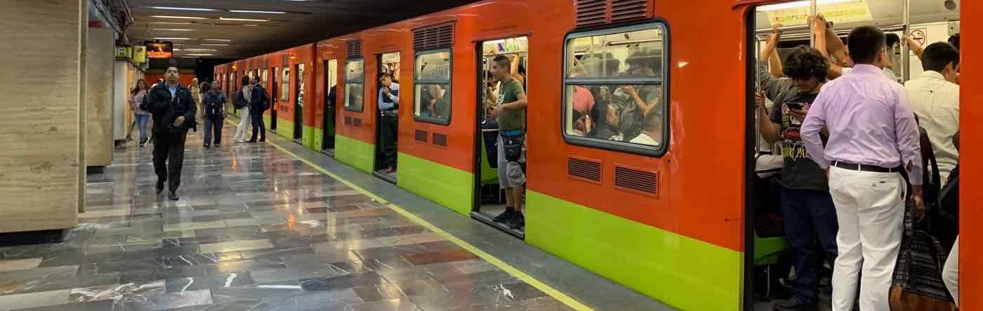
- Mexico City Metro
- London Tube
We compared them based on 21 criteria including: coverage, accessibility, and ease of navigation, rating criteria on a scale of 0 to 4. This approach offers a holistic view while allowing evaluation from multiple perspectives.
Key Findings
Our analysis revealed MARTA's strengths in navigation, accessibility, and visual design. However, it lagged behind in coverage and reliability.
To effectively support World Cup visitors, MARTA should:
- Simplify and expand ticketing systems.
- Improve station navigation and system usability.
- Enhance safety features to reduce user stress and fears.
Surveys
After gaining a better understanding of the problem area with background research, we set out to better understand our primary users.
Method Details
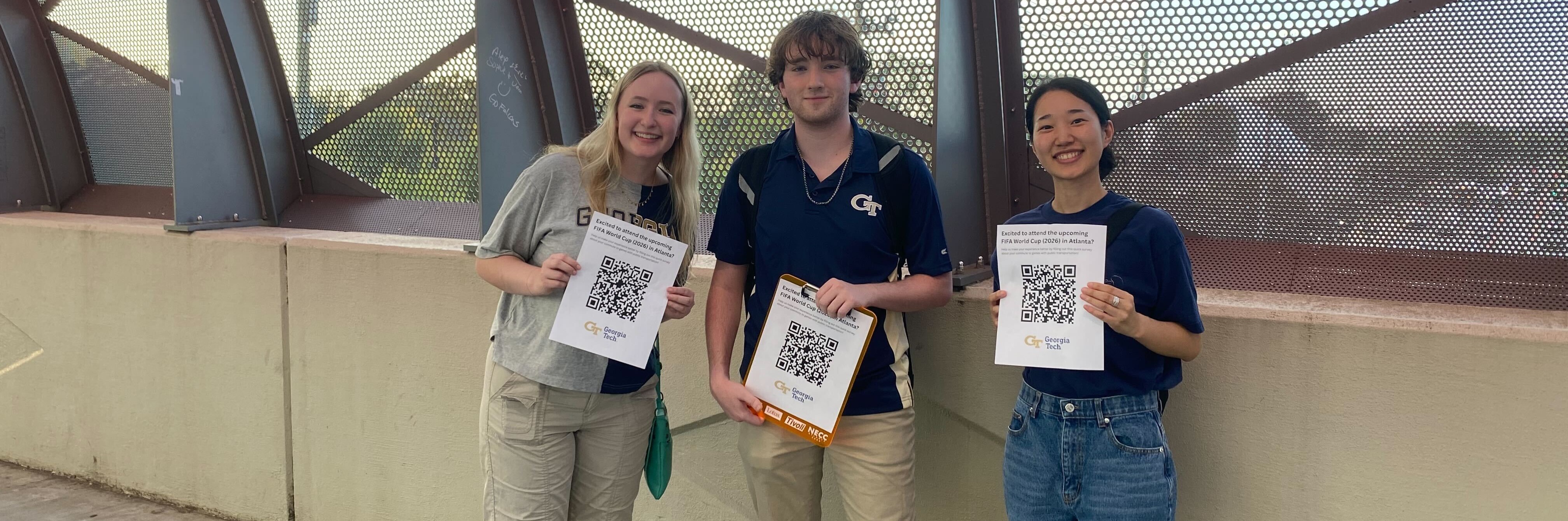
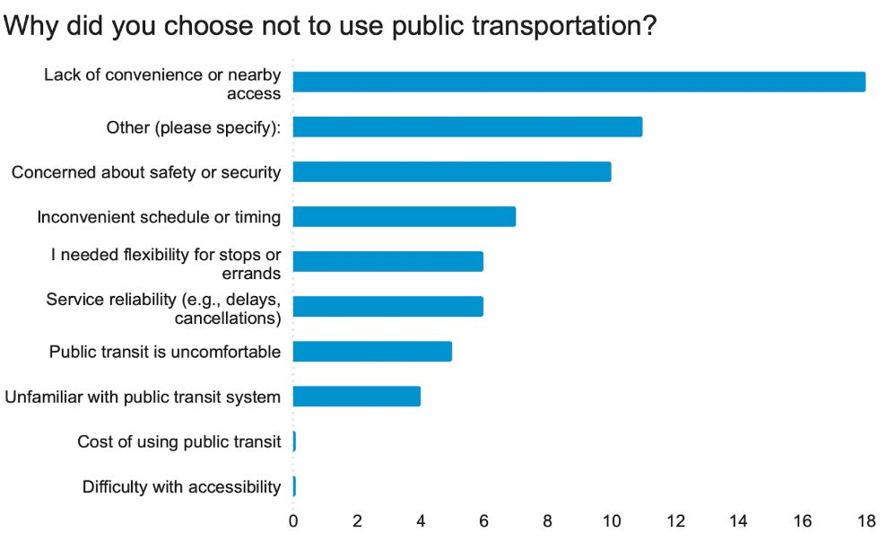
After refining our survey questions, we distributed surveys outside of the Atlanta World Cup venue, Mercedes-Benz Stadium. Soccer fans travelling to the stadium for events perfectly fit our target behavior.
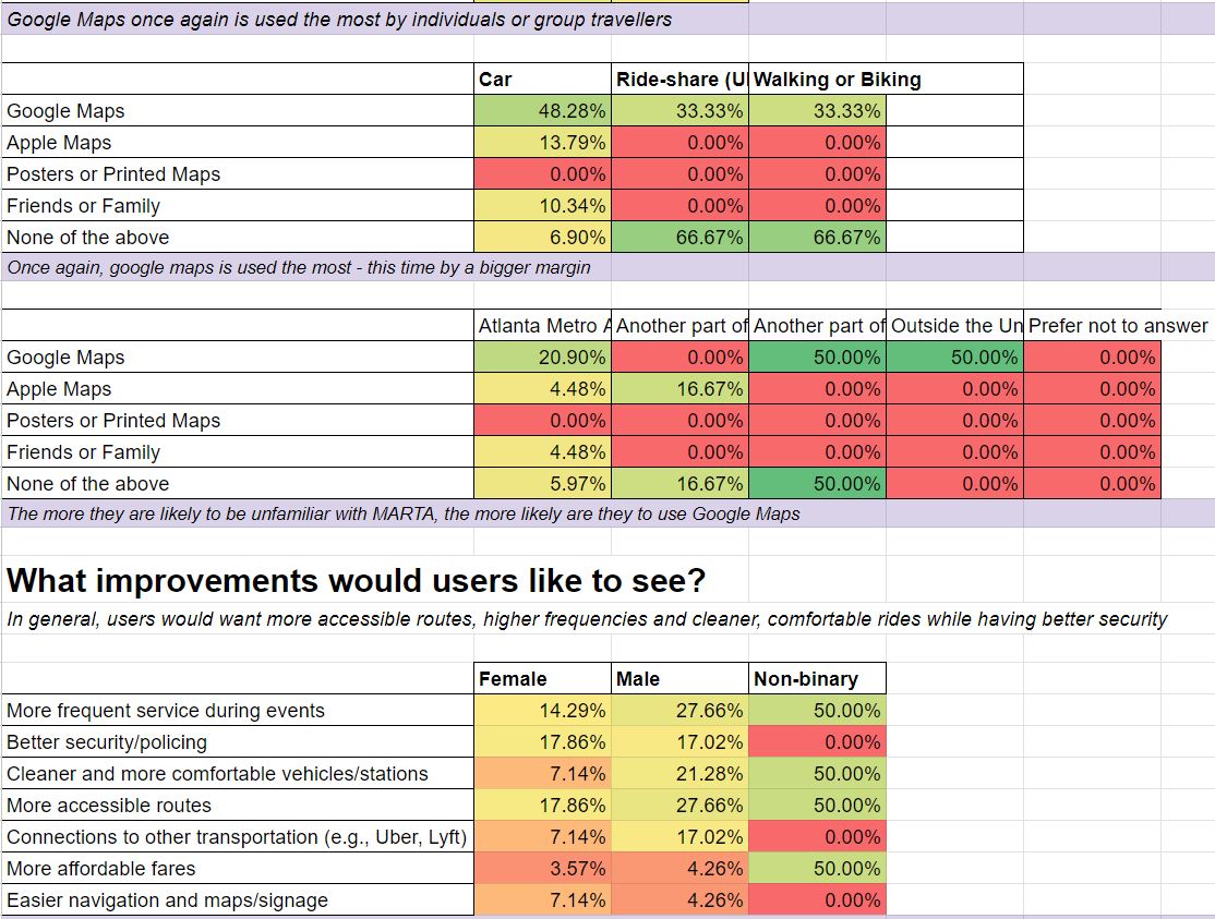
Using QR codes, we collected 104 responses with 18 questions using Qualtrics. We then visualizaed the data in graphs, tables, and charts.
Key Findings
| Most important transit app features: | Transit alternatives chosen because: | MARTA riders most concered with: |
|---|---|---|
| Real-time updates (26%) Fare payment (22%) Event suggestions (13%) Crowd info (13%) |
Crime/harassment (27%) Reliability (24%) Train issues (17%) real-time info gaps (15%) |
Inconvenience (27%) Accessibility (15%) Transit Cost (10%) Service Reliability (9%) |
- 83% of users travel with at least one other person
- 46% of people used no MARTA app
Semi-Structured Interviews
From surveys and MARTA community groups, our team recruited several interview participants to create a deeper understanding of the key issue and users.
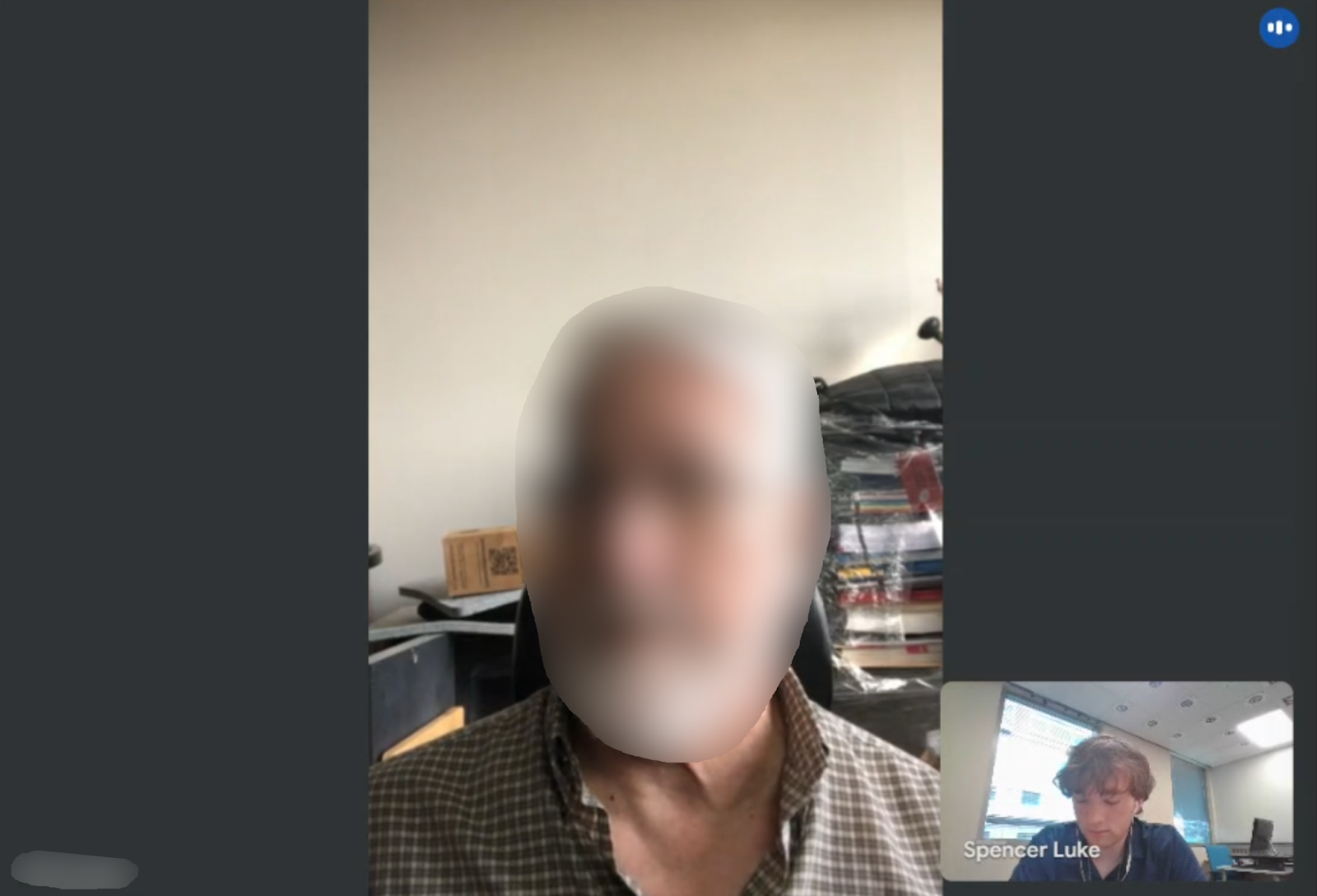
Method Details
Our team conducted 10 interviews lasting between 25 to 50 minutes each. Interviewees consisted of consistent MARTA users, riders with disabilities, and travelling sport fans.
We used interviews to gather thick, in-depth qualitative data to better understand user experiences and pain-points from various perspectives.
Key Findings
We analyzed our interview findings by coding the transcript data using MAXQDA. We then organized key points into an affinity map to organized overall findings.
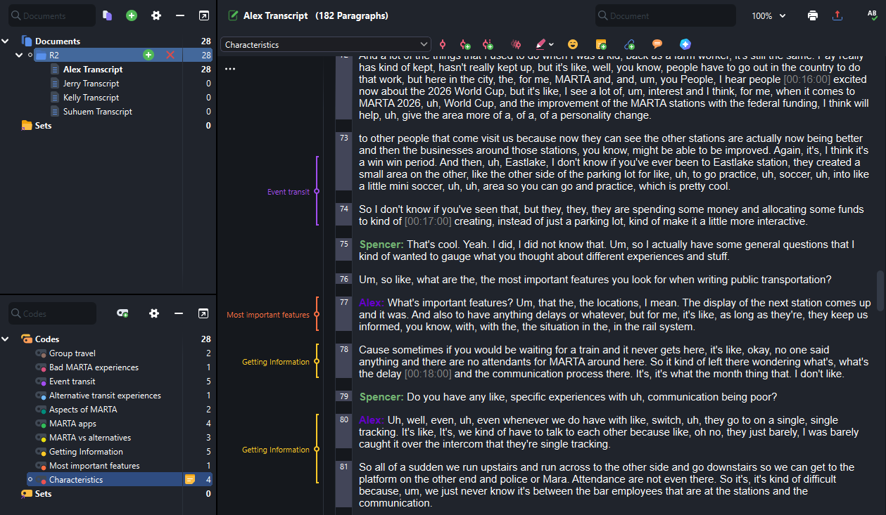
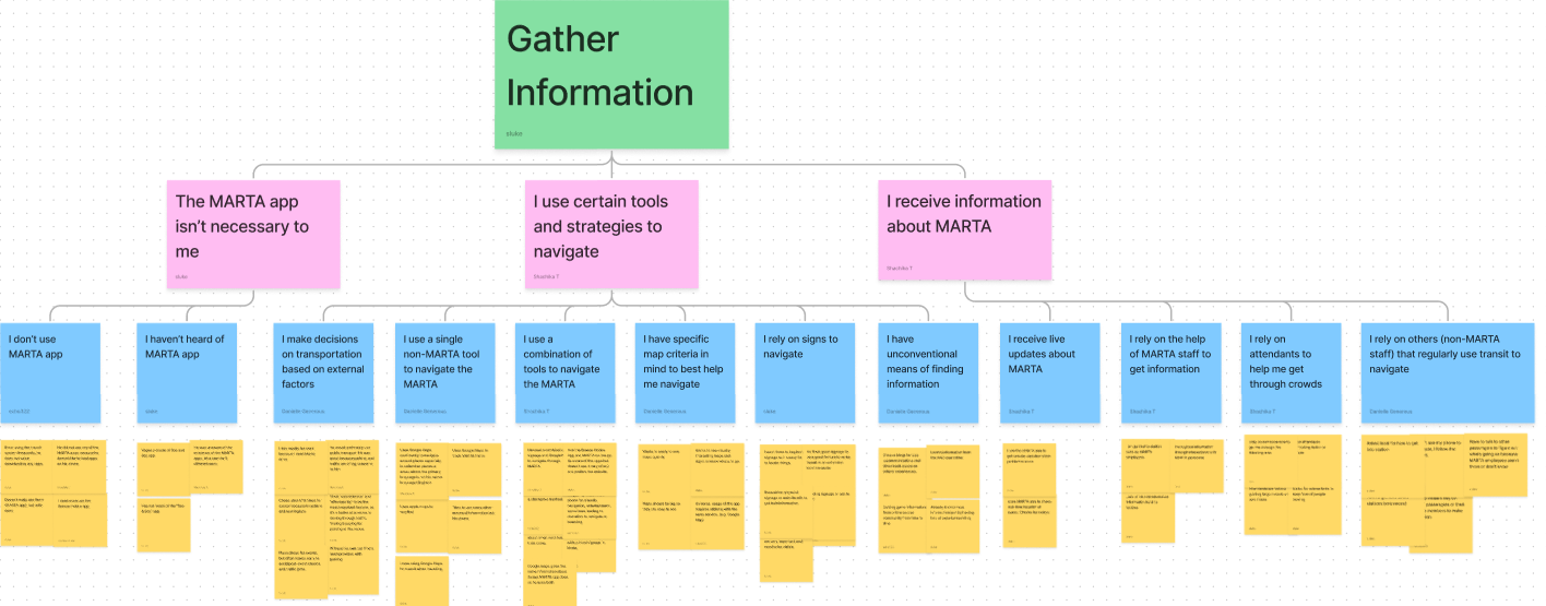
Key findings from the affinity map include:
- Users want to be able to easily access live-transit information
- Users are concerned about safety, but few are aware of the report app
- Users find there are too many apps and they are confusing to use
- Users have difficulty travelling with groups and want to coordinate
- Users with children struggle to use the ticketing system
- Users want to learn about events and feel event excitement
Ethnographic Observations
Our team conducted 2 types of ethnographic observations each lasting around 1 hour. We wanted to gain a deep understanding of the behaviors and interactions of users in a natural environment.
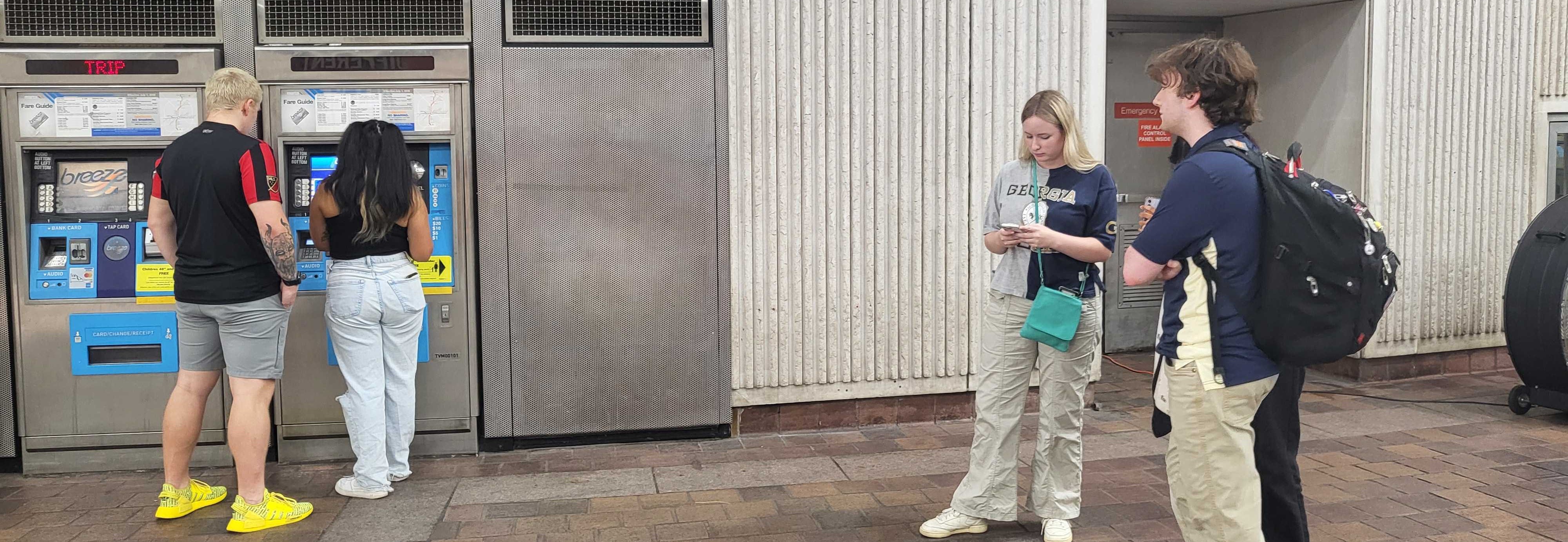
Method Details
In phase 1, our team took observational notes travelling to the Mercedes-Benz stadium during a soccer match, taking notes on features and behaviors.
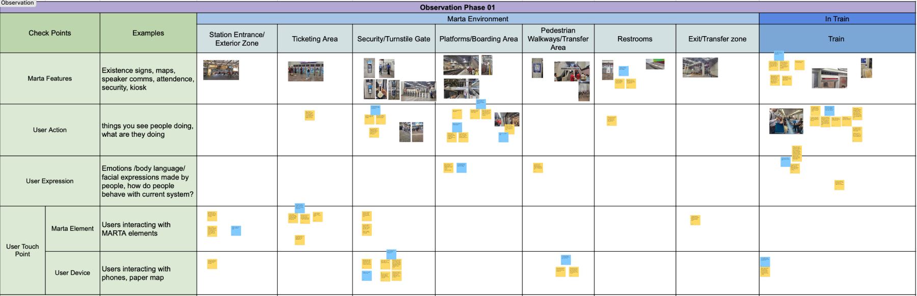
In phase 2, each team member followed specific people on their transit journey, such as groups and foreign riders.
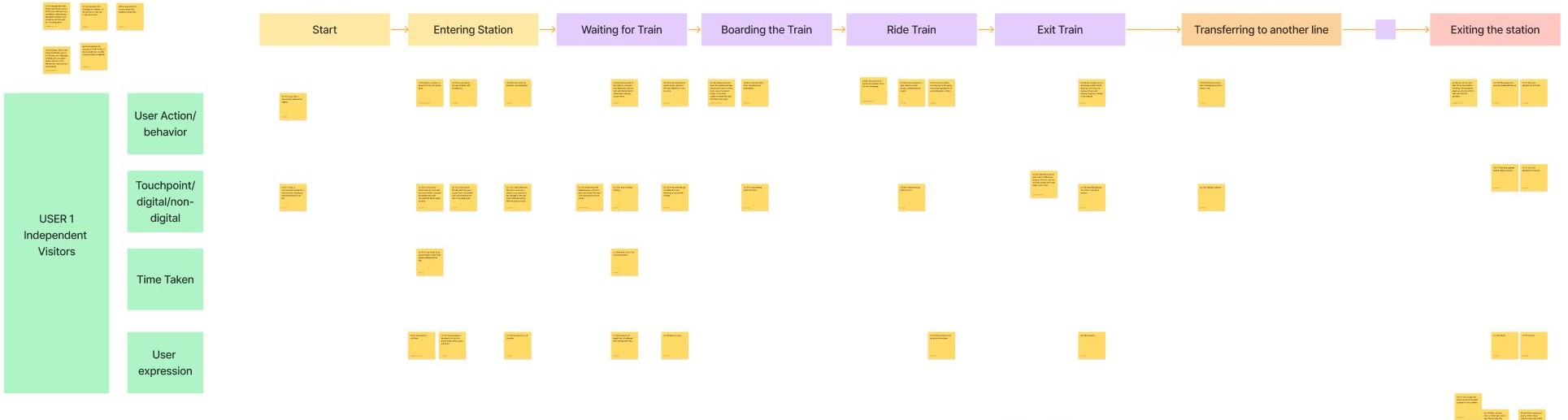
Key Findings
Notes for both phases were recorded in observational charts in Figma to best analyze the results. From our analysis we found:
| Group Travellers | Solo Travellers |
|---|---|
| - Struggled to scan QR tickets - Relied on group members to make decisions - More delays at turnstile gates |
- Hesitated or showed confusion about directions - Frequently used phone for directions - Moved quickly through gates |
Video Observations
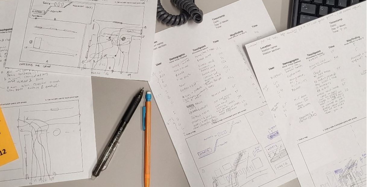
Our team got permission from MARTA to observe CCTV footage at their headquarters. We hoped to observe target users in the context of the behavior of interest.
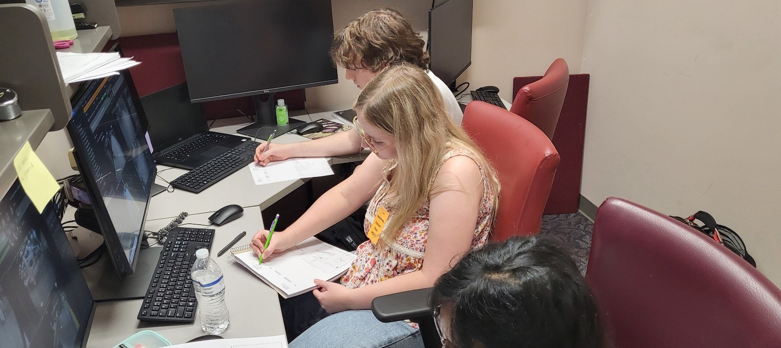
Method Details
We prepared observation sheets and recorded user interactions, time of completion, ease of action, and demographic traits. We also drew representations of user journeys on maps to record pain-point locations.
Key Findings
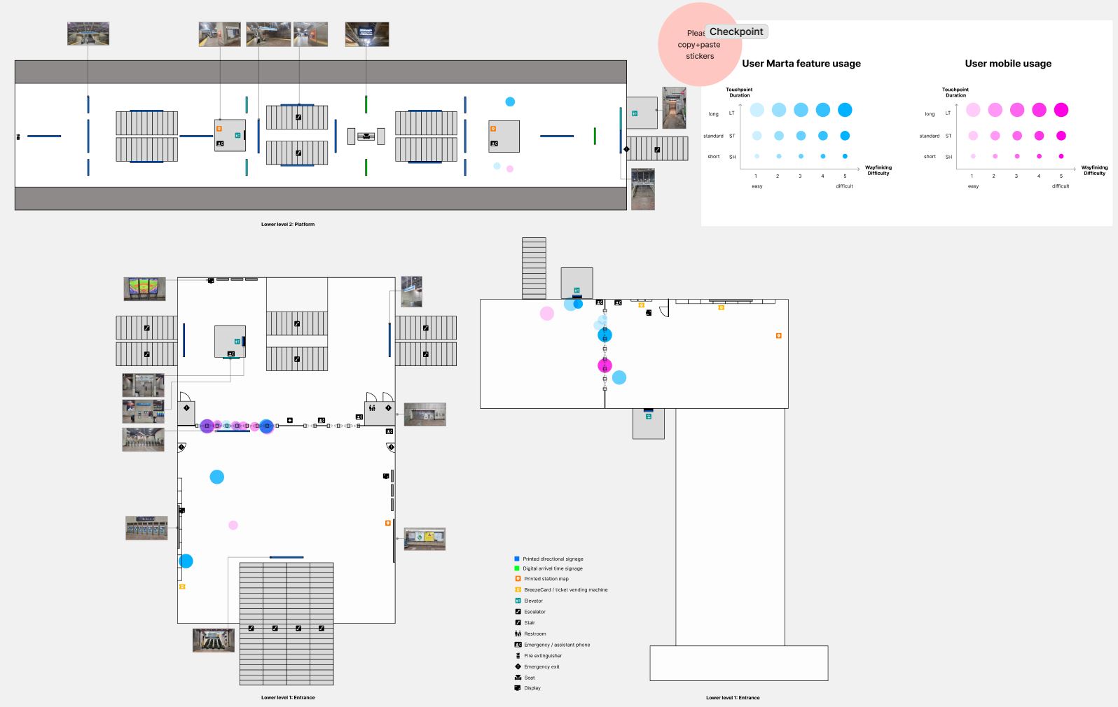
- Users tend to check their phones and signage to navigate
- Users often struggled and spent extra time in the ticketing area
- Most users seeking help from MARTA personnel seem to be using the mobile Breeze QR ticket
- Group visitors often struggled with the turnstiles
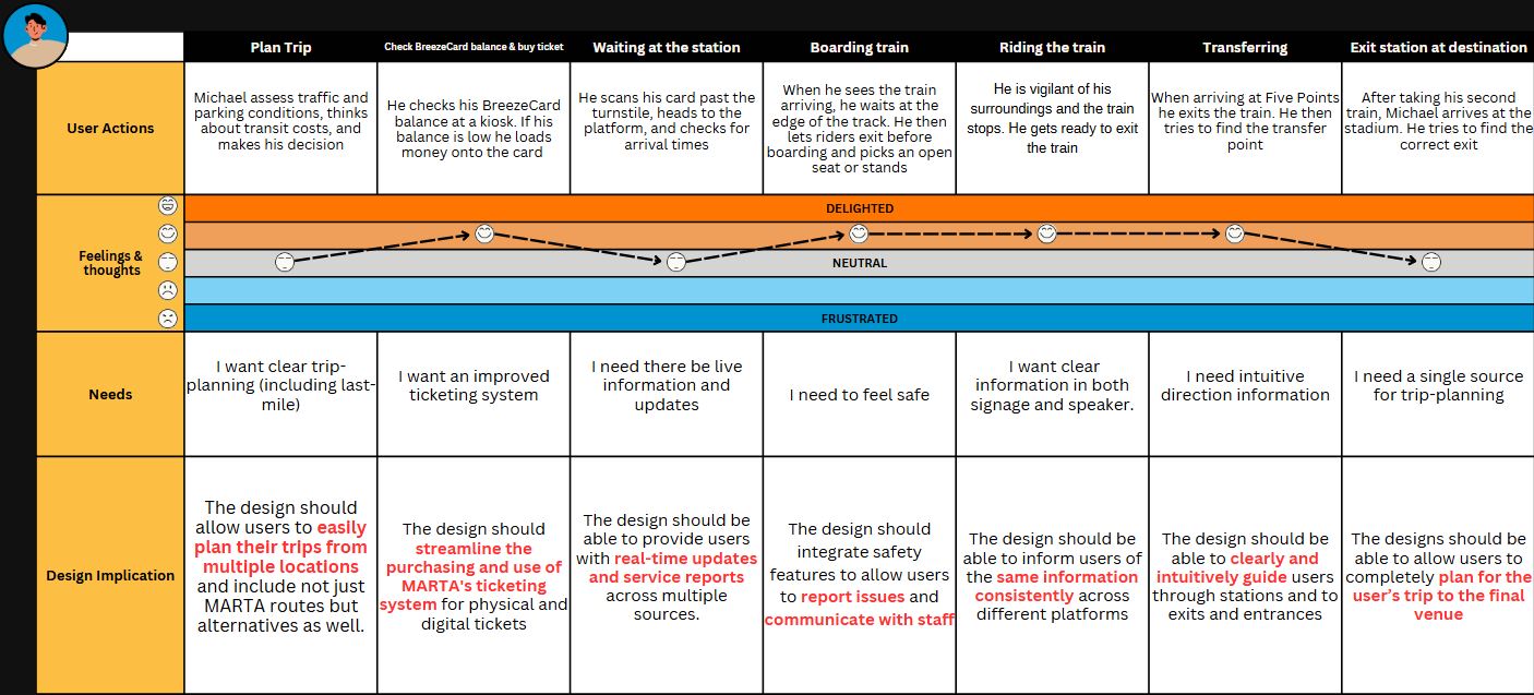
Personas and Journey Maps
From our user needs research, we visualized our potential users and their needs, expectations, and goals.
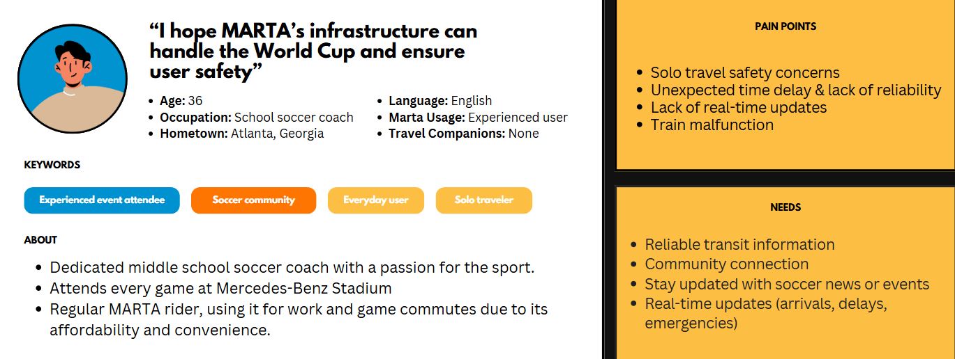
Michael
Michael, a dedicated MARTA rider and passionate soccer fan, is heading to the World Cup. While he typically navigates the transit system with ease, occasional frustrations still arise.
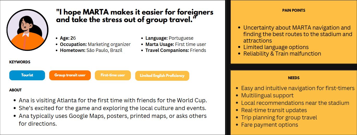
Ana
Ana, a young woman from Brazil, is new to MARTA and speaks limited English. Navigating the system proves challenging, as she encounters numerous barriers with minimal support available.
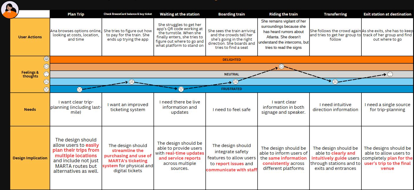
Research Design Implications
From our user research and visualizations, we determined several design implications intended to support and incentivize MARTA use:
- Include relevant, exciting, and interactive elements to encourage users to use MARTA during the World Cup
- Provide users with real-time updates and service reports
- Allow users to easily plan their trips from multiple locations and include not just MARTA routes
- Allow users to contact or communicate with MARTA staff for assistance
- Streamline the purchasing and use of MARTA's ticketing system for physical and digital tickets
- Include features to enable social connection and share trip details
- Encompass many features in a single, comprehensive system
- Clearly and intuitively guide users through stations and to exits and entrances
Ideation
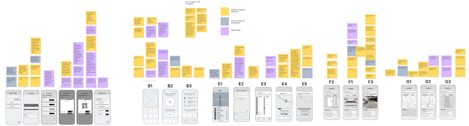
Based on our design implications, our team came up with 10 ideas each and wrote them down.
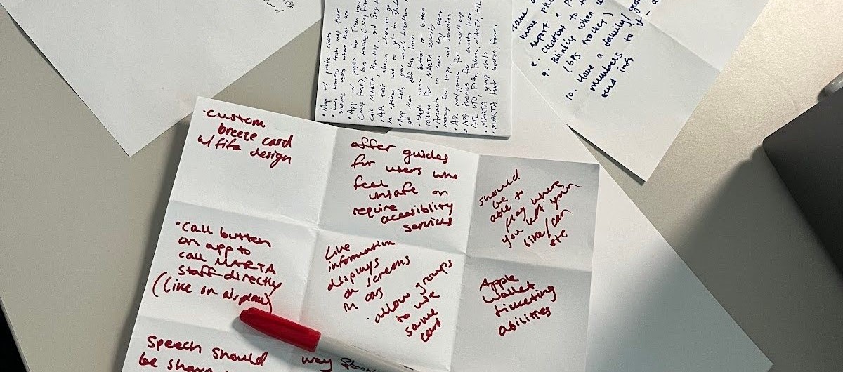
We then participated in crazy eights, sketching 8 ideas each. We grouped these ideas together by similarity.
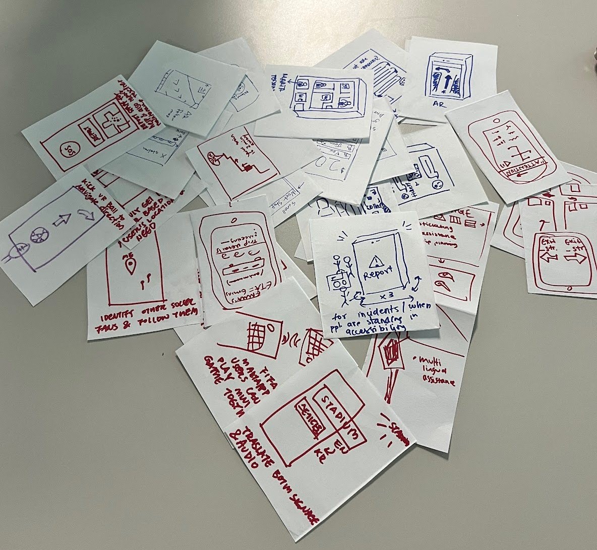
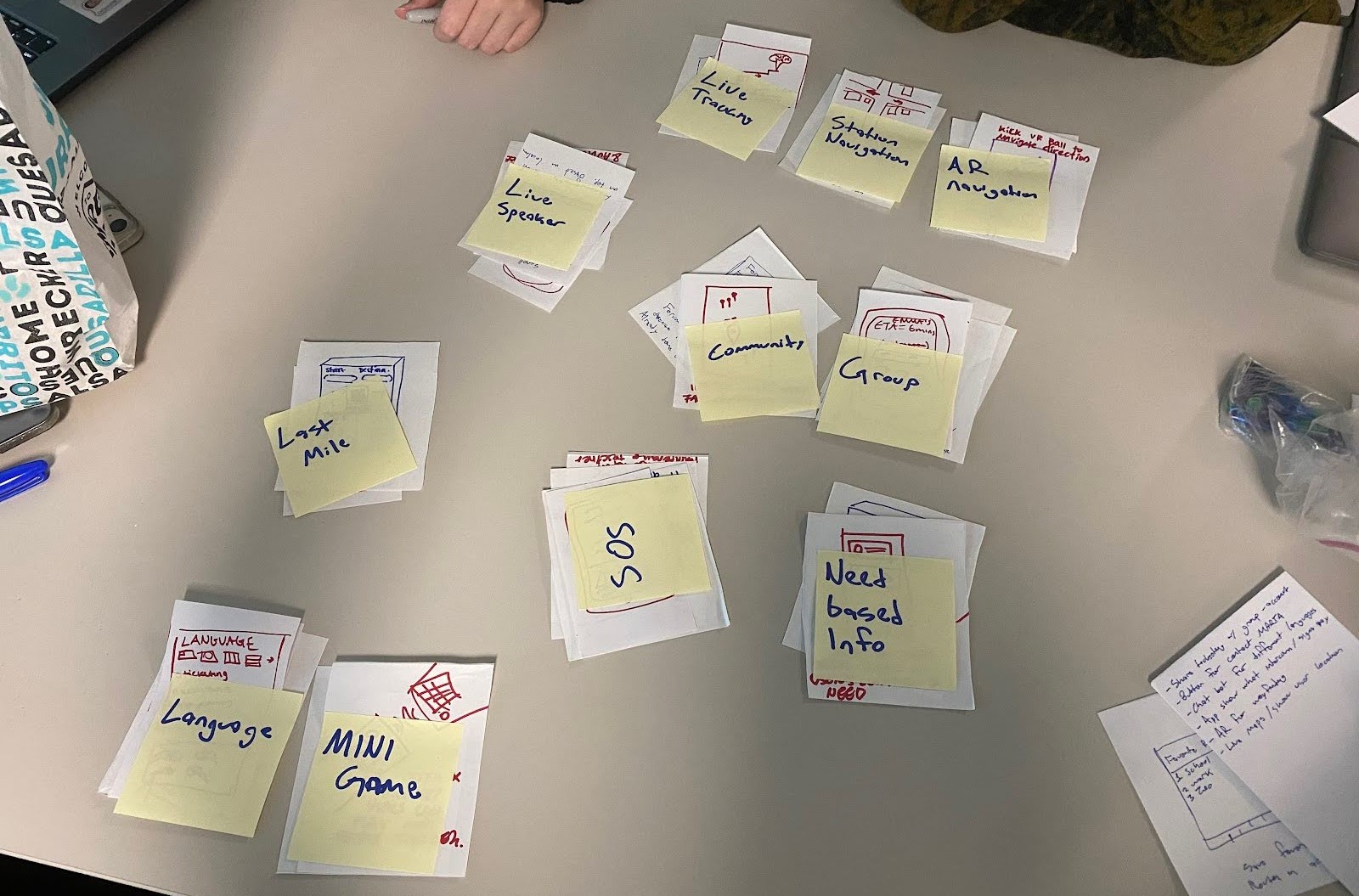
Sketches
After our brainstorming session, we created various sketches in Figma and evaluated them.
Sketches
Live-Tracking
Navigation
Safety and Report
Group Features
Trip Planning
Evaluation
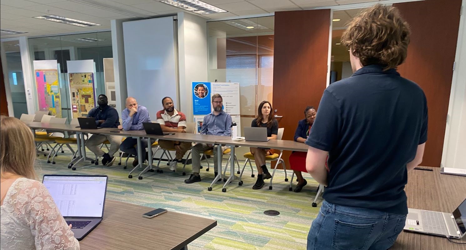
After creating sketches in Figma, our team held 2 moderated focus group sessions. During feedback sessions we presented groups with our lo-fidelity sketches and discussed functionality, intuitiveness, and accessibility.
Focus Group 1
The first focus group, held on Google Meet, included 4 members from the Rider Advisory Council (RAC) and MARTA Accessibility Committee (MAC) to gather feedback from MARTA riders and potential users.
Focus Group 2
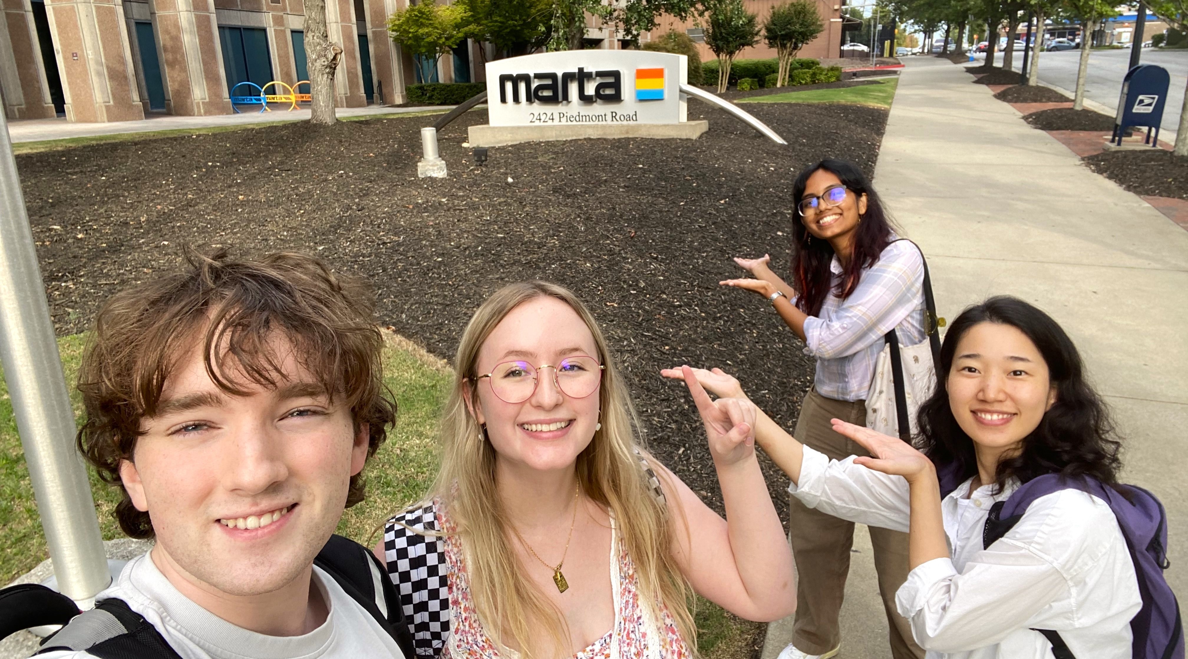
The second focus group was held a MARTA's HQ in Atlanta with 6 experts in customer experience, design, and accessibility. They provided valuable insider perspectives, deepening our understanding of user needs.
Analysis and Findings
We analyzed our sketch feedback by organizing our notes on FigJam. Then we organized notes by user, context, and feature discussed. From the sketch evaluation analysis we found that users:
| Finding | Solution | |
|---|---|---|
| 1. | Enjoyed group planning features, but found them difficult to understand | Make the design more intuitive to lower tech savviness requirements |
| 2. | Report feature is simple, but it may be hard to inform staff our user location | Allow users to provide more information about their location |
| 3. | Uncertain about chatbot features | Find right use cases for users |
| 4. | Want to see accessibility information for stations, elevators, and bathrooms | Provide information about accessibility for stations |
| 5. | Desire live information and directions | Prioritize life info and navigation |
| 6. | Forums better elsewhere (Reddit) | Remove discussion forums |
| 7. | Concerns of a FIFA traveler are different from that of everyday rider | Further account for World Cup target user group |
| 8. | High cognitive load of trip planning | Prioritize and simplify trip planning |
Overall, the sketch feedback indicated we needed to refocus our design and simplify several features.
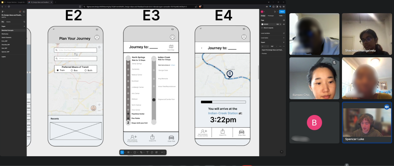
Wireframes
Based on feedback from our sketches, we developed mid-fidelity wireframes to conduct user evaluations. These insights guided the creation of a high-fidelity prototype.
Evaluation
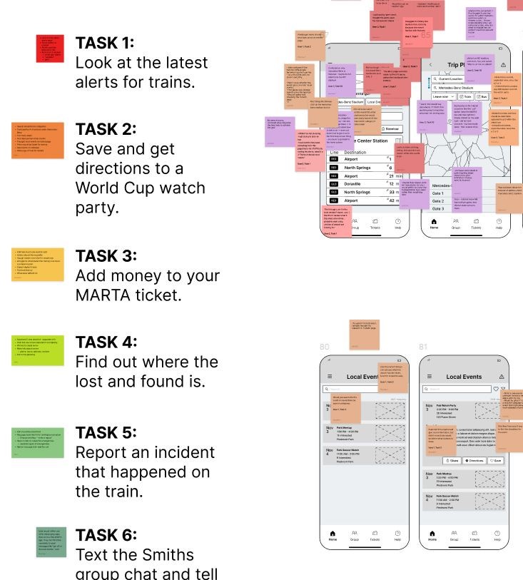
To fully evaluate our wireframes, we conducted think-aloud usability tests with 4 non-student participants, selected for their diverse backgrounds, including varying experience with MARTA and international transit systems.
Participants interacted with fully functional phone prototypes designed to emulate the final product. Participants were presented with realistic scenarios reflecting challenges faced by our personas and completed 10 progressively complex tasks.

Tasks and Questions
Users were asked to complete tasks such as:
- Save and get directions to a World Cup watch party
- Report an incident that happened on the train
- Share a meeting spot for the Smiths group to meet up
After each task users would be asked several questions including:
- Evaluate the difficulty of various features
- Identify elements that met or failed to meet expectations
- Express areas where they want to see change
Analysis and Findings
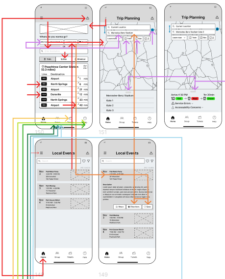
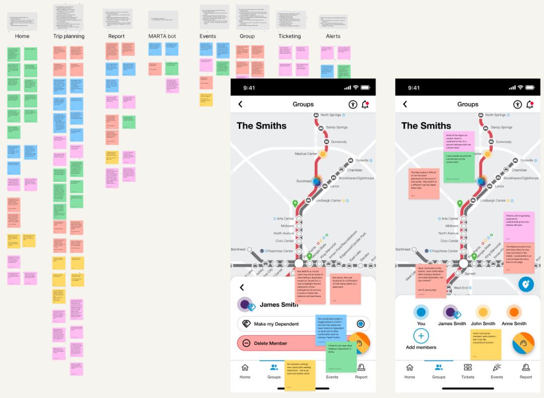
We analyzed our wireframe feedback by organizing our notes in FigJam by task and color-coded them. We then incorporated color-coded arrows into our wireframes to map user actions during tasks. This visual representation enabled our team to pinpoint UI challenges and confusion more effectively.
Findings
| 1. | Revisit our language and iconography to make features more intuitive |
|---|---|
| 2. | Promote other ticketing options outside of MARTA (e.g. hotel deals) |
| 3. | Use more universal elements, most users will be new to Atlanta and MARTA |
| 4. | Reanalyze the user flow to reduce the cognitive load users face |
| 5. | Clarify the distinction between emergency and casual reports |
| 6. | Find the right use for the chat bot and allow it to provide more information |
| 7. | Improve UI accessibility to promote foreign languages and accessibility tools |
| 8. | Make service and emergency alerts more pronounced and relevant to users |
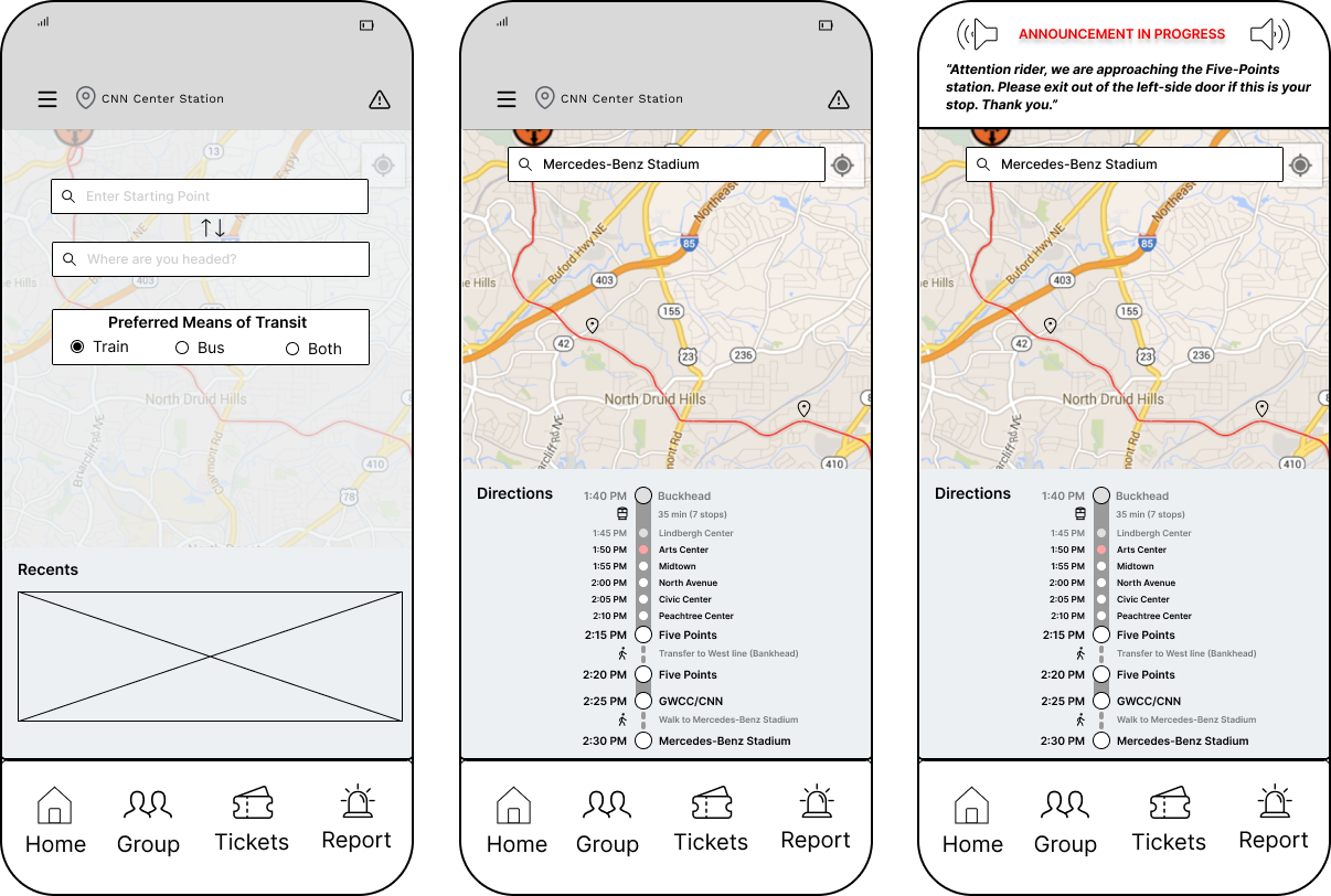
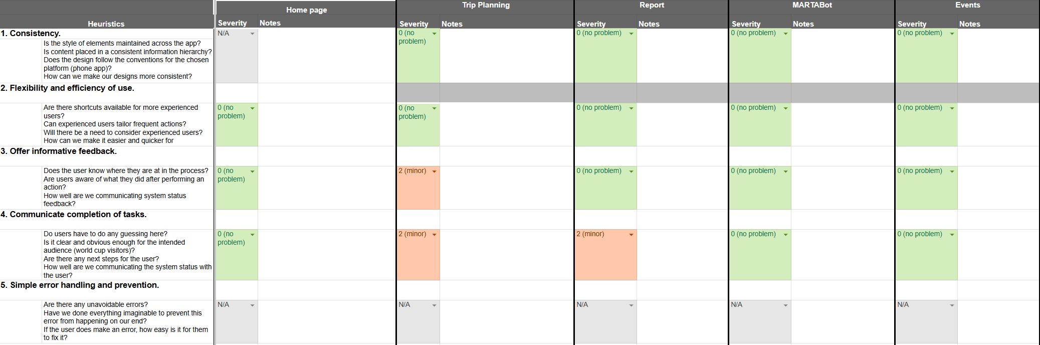
Prototype
Check out the prototype below by using the arrows.
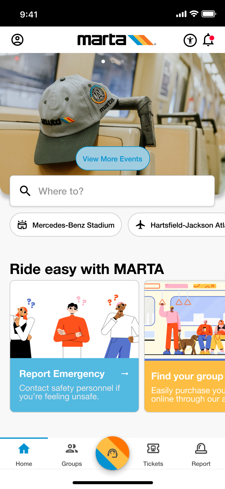
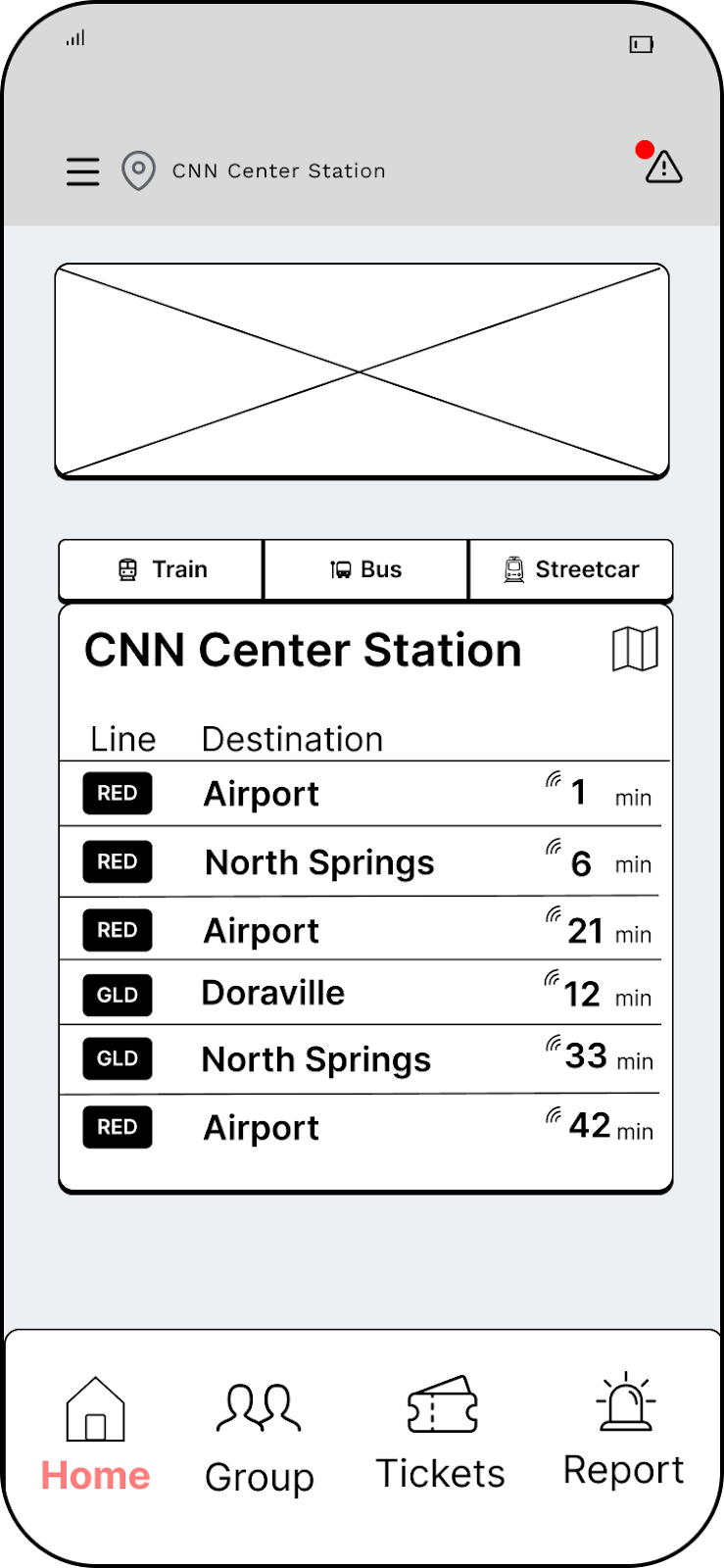
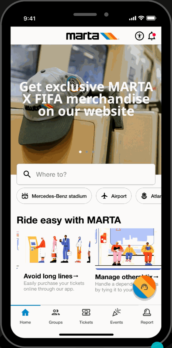
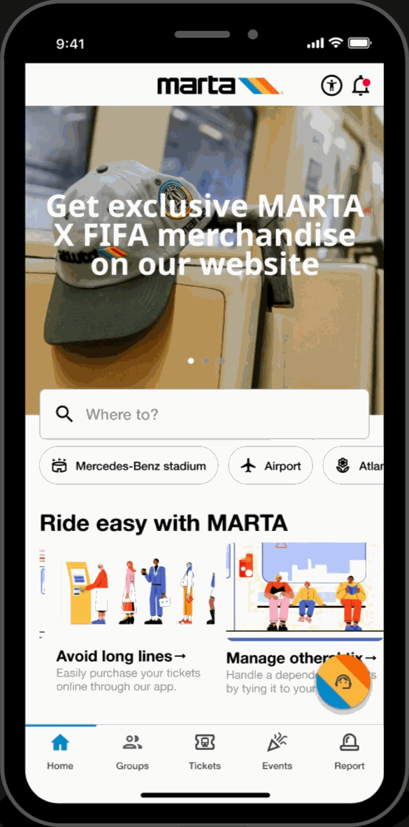
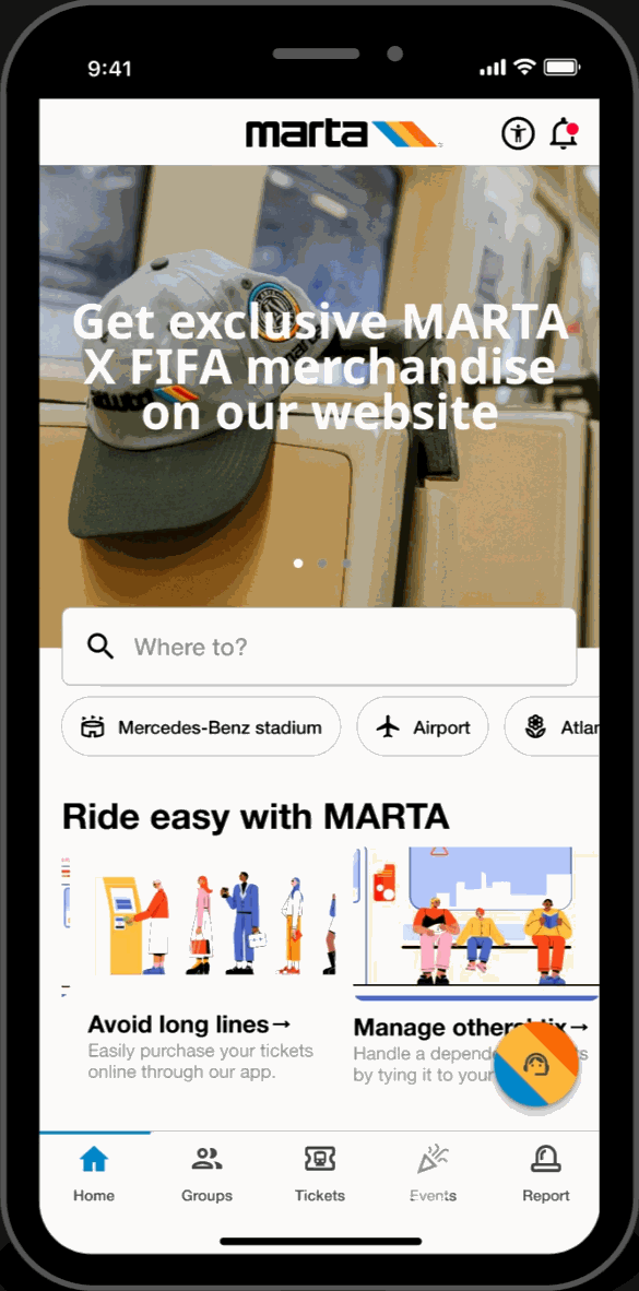
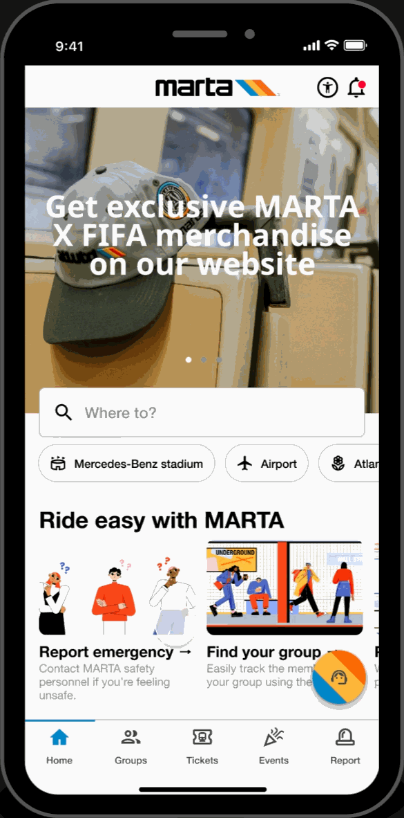
Home Page
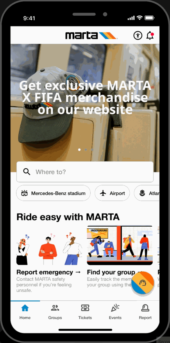
Featured Showcase
- Scroll carousel featured section displaying Atlanta's top attractions and local events at the top of the homepage for easy access to trending topics.
Hot-spots
- Home page highlights key locations relevant to FIFA World Cup travelers. Allows for easy-access to these key locations.
Easy-Access Tabs
- Displays introduction and overview of the application's key functionalities and offers secondary navigation for new users.
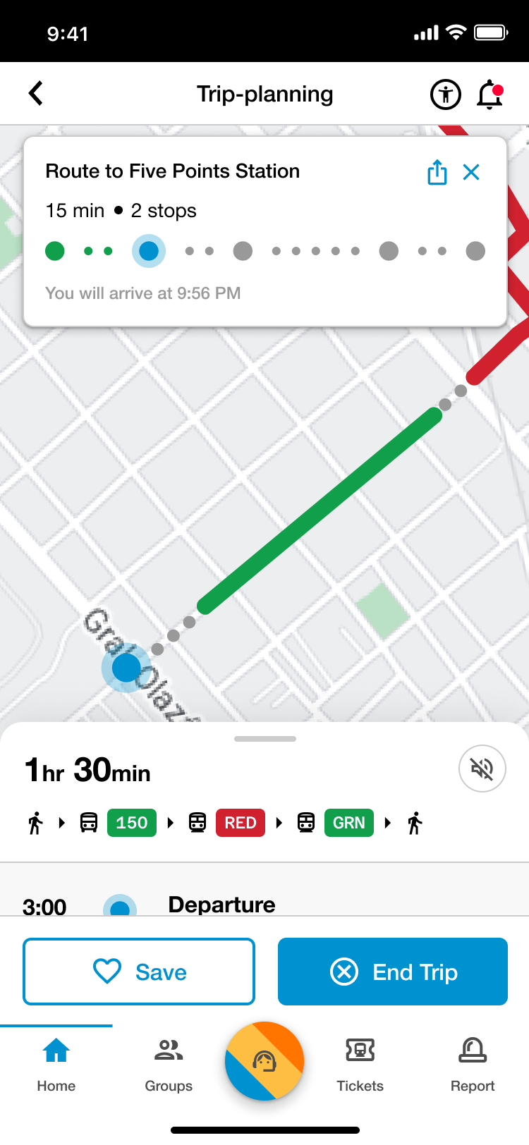
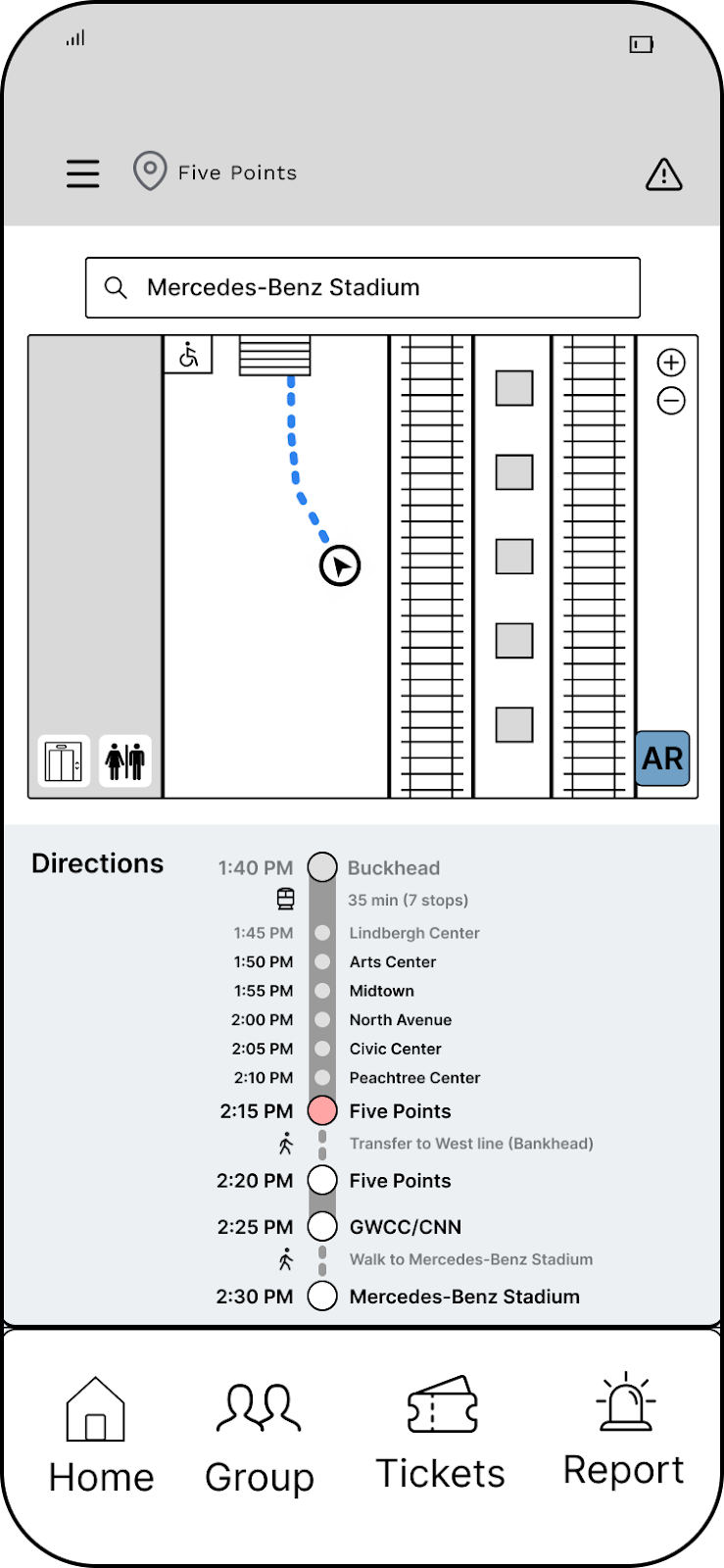
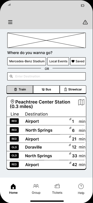
Trip Planning

Customized Routes
- Filter through and select various means of transit (e.g., walking, Uber, biking) to assist in finding the most efficient transit.
Real-Time Data & Tracking
- View upcoming train arrivals relevant to the user's route.
Live Transit & Station Updates
- View updates on relevant service errors and accessibility concerns along the user's journey to assist in keeping users informed.
Alert Page
Alerts
- Accesibile on every page, users can filter through and view service and facility alerts. This feature keeps users informed and assists in their trip-planning process.
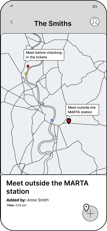
Group Page
Live Group Member Locations
- View locations of group members to stay connected while traveling.
Meetup Pins
- Engage in built-in communication for group travel coordination by labeling and dropping pins for synchronized ride exits and meeting points.
Dependent Mode
- Make group members 'dependents' to purchase and hold tickets on their behalf. Ideal for young children, elderly and disabled riders.
Tickets Page
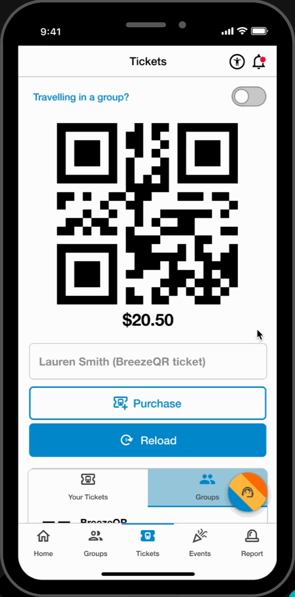
Easy Access Tickets
- Reload and purchase tickets directly from the ticketing page. Toggle between tickets for easy access to the user's machine-scannable QR code.
Group Ticketing
- Toggle between users to reload and scan tickets on behalf of dependent group members.
Ticket Bundles
- Streamlined ticket purchasing and ticket management on both local events and MARTA rides.
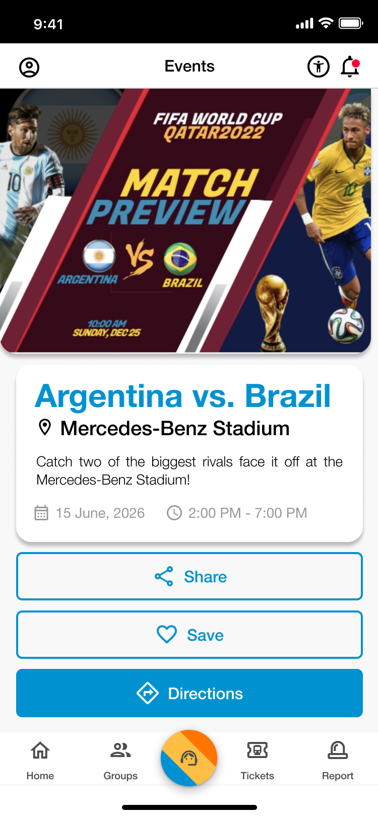
Events Page
Upcoming Games
- Search and view upcoming FIFA World Cup games. Read event descriptions and get directions to their location.
Saved Events
- Save upcoming games and popular events to the saved section of the page. Revisit these saved events at any time and receive directions to their location.
Popular Events
- Browse through FIFA related events. Filter by “pre-game,” “post-game,” and, “all”. Read descriptions and get directions to these events.
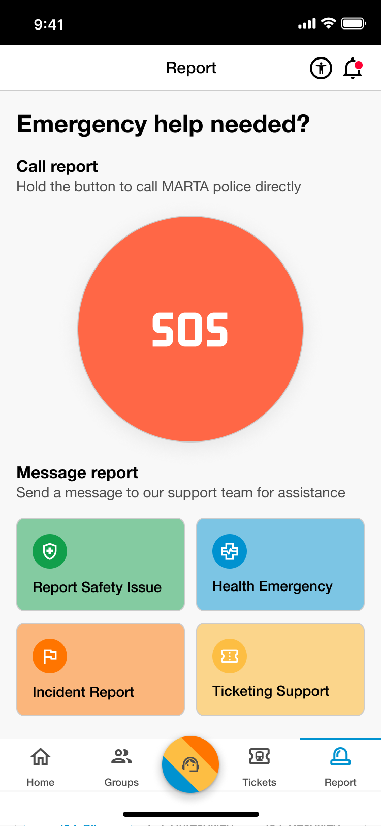
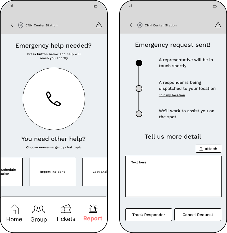
Report Page

SOS Call
- Submit a direct emergency report by calling or texting the MPD.
Reports
- Filter through various report-types and communicate indirectly with the MPD.
History
- Look through previous submitted reports and track status updates on their progress.
Chatbot
MARTA Support
- Interact with MARTA's “MARTABOT”, an AI assistant designed for timely and reliable support.
Evaluation
The final step of our four-month MARTA research and design project involved evaluating our high-fidelity prototypes.
Overview
| Heuristic Evaluation | Usability Test | |
|---|---|---|
| Participants | 5 user experience and customer experience experts | 5 potential users that are MARTA users or are World Cup fans |
| Method | Experts completed heuristic evaluations, rating features based on heuristics | Users carried out a set of 8 tasks while being asked to think out loud |
Heuristic Evaluation
To evaluate our prototype, we had MARTA UX experts evaluate parts of our design based on a mix of Nielsen and Shneiderman's heuristics. Participants rated each page on a scale of 0-4 and gave explanations.
Participants
Participants included 4 MARTA UX and customer experience experts and 1 Georgia Tech HCI UX expert.
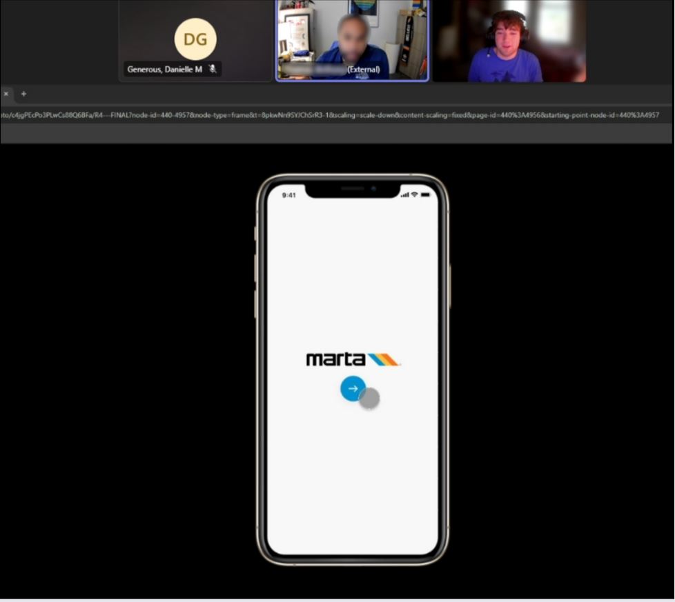
Analysis
To analyze our findings, we organized expert notes by task and visualized problem areas by layering the notes directly onto the prototype.
We also visualized heuristic severity ratings in Excel to calculate evaluation statistics.
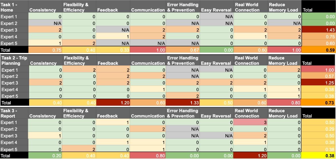
Findings
Group Ticketing
|
Alerts & Notifications
|
|---|---|
Navigation & Layout
|
Clarity & Usability
|
Usability Test
In our final test, users interacted with our prototype to complete tasks and provide feedback. Follow-up questions were then used to evaluate usability and gather additional insights.
Participants
Participants were collected from MARTA and program connections. Participants ranged from 21 to 51 years old and all claimed to be "interested" or "likely" to attend the World Cup.
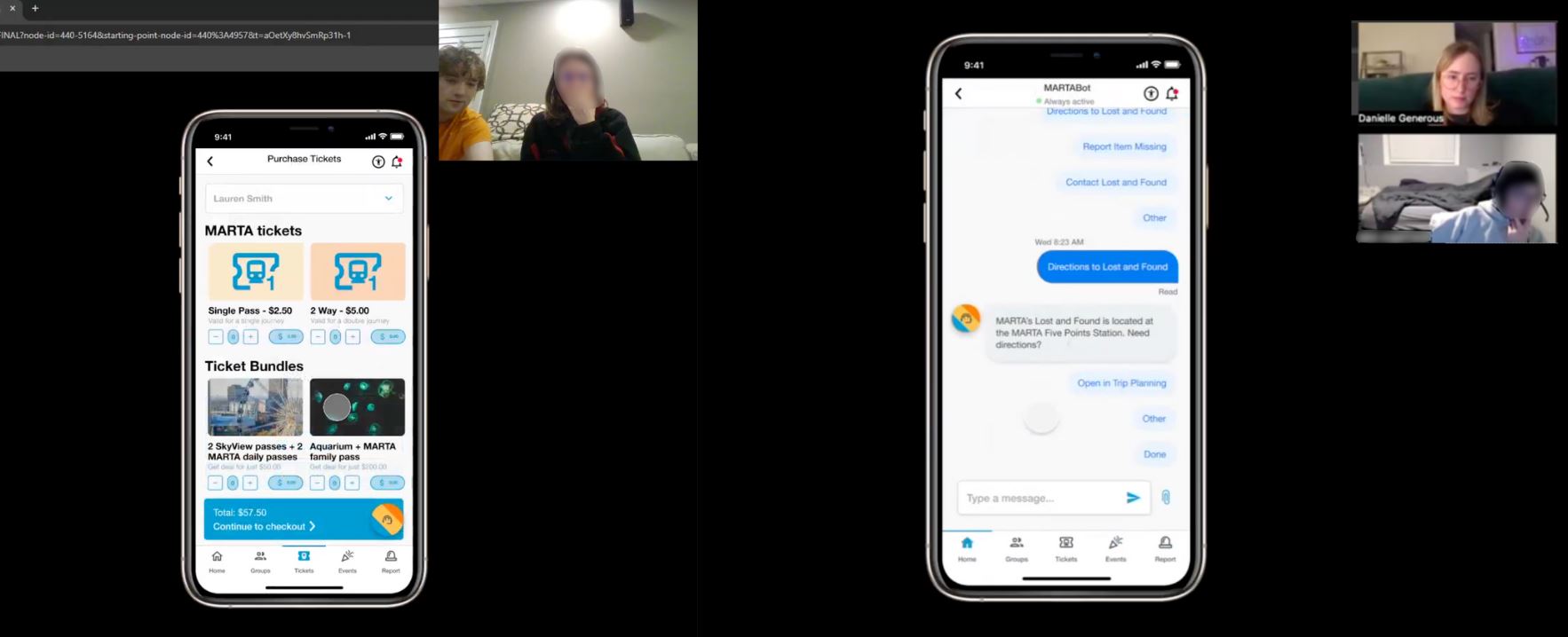
Analysis
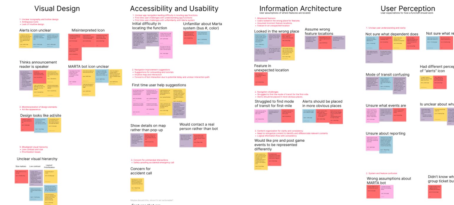
During interviews, we had dedicated note takers who recorded all reactions, frustrations, and interactions. We built an affinity map based on the categories to best evaluate feedback.
Additionally, we collected metrics through video recordings such as # of clicks, # of errors, and time of completion between users.
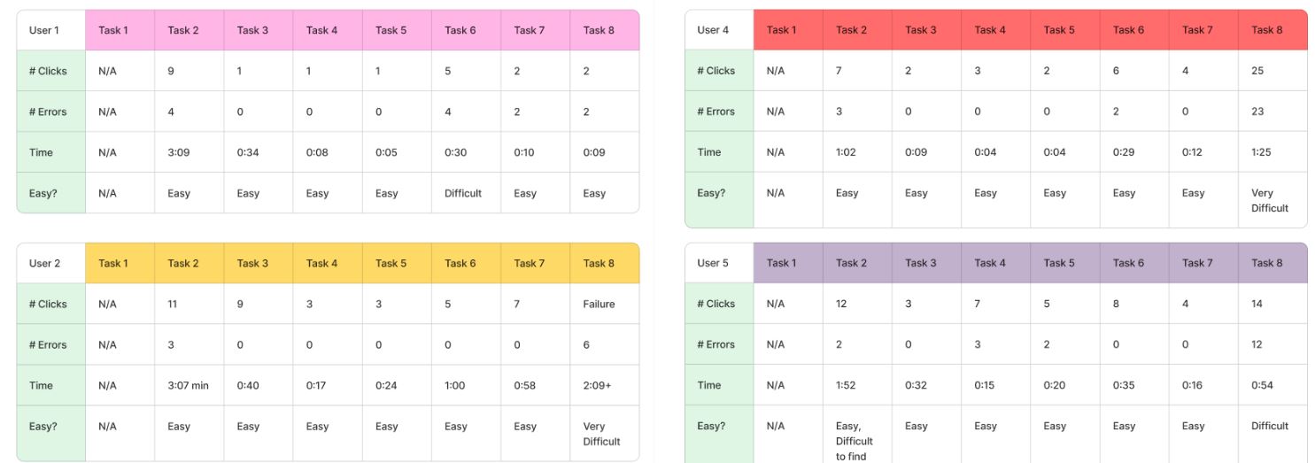
Findings
Visual Design
|
Accessibility & Usability
|
|---|---|
Information Architecture
|
User Perception
|
Impact and Reflection
Next Steps
| Implement | Introduce | Eliminate |
|---|---|---|
|
|
|
Results
In December 2024, we presented our research and design process to our professors and 3 representatives from MARTA. Watch our presentation and view our slides below:
As MARTA moves towards the unified app design and prepares for the World Cup, we hope they will utilize our research and designs to further guide development.
Lessons Learned
- Fieldwork and research never goes as planned, you need to be able to adapt as the situation changes
- Send out emails for meetings ASAP because people can take forever to respond and schedule
- Narrow down the problem area early to avoid wasting time answering useless research questions
- When ideating and designing avoid losing sight of primary objective
- Spend time getting everyone to see the big picture and end goal
Contribution
Research
- I created a detailed plan for each step of the research project
- I built interview guides and scripts as well as designed survey questions
- I recruited participants and distributed surveys
Design
- I helped make design decisions backed by our research
- I helped design wireframes and prototypes in Figma
Evaluation
- I wrote evaluation guides for heuristic and usability tests
- I recruited experts and users to evaluate our designs
- I created charts for participants to fill out during evaluations